
Kanan

Realty

Branding
A premium sustainable real estate developer that blends modern architecture with the serenity of Coorg’s natural landscape.

Challenges
The existing perception of Kanan was cluttered, sales-driven, and visually loud. They needed a distinct identity that would break away from this norm—something that feels calm, premium, and deeply connected to its natural surroundings while still appealing to a modern, global audience.

Discovery & Strategy
We built the brand around a simple yet powerful idea: “Where Nature Becomes Home.” The goal was to create a visual and verbal identity that reflects stillness, sophistication, and intentional design.

Brand Identity
We crafted a minimal and timeless identity rooted in Kanan’s connection to nature and premium living. A refined green palette was developed—anchored by deep forest green to evoke depth, stability, and natural luxury, supported by warm white and charcoal black for balance and sophistication. The visual language focuses on simplicity, space, and quiet confidence.

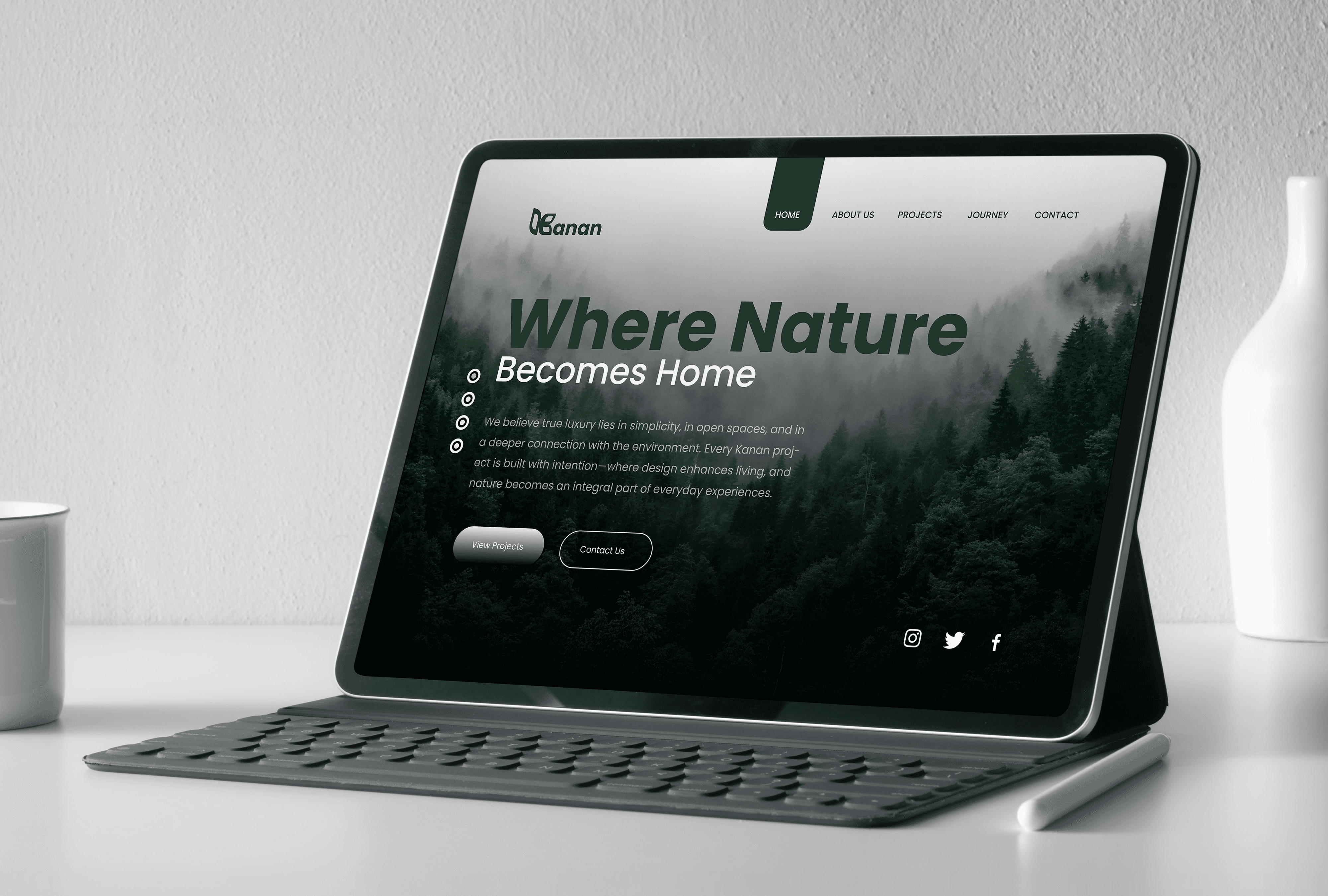
Website Design
The website was designed as a calm, immersive experience rather than a conventional real estate interface. Clean layouts, generous whitespace, and soft green tones create a sense of openness and ease. Poppins was chosen for its modern, geometric clarity—ensuring readability while maintaining a contemporary, premium feel across all screen sizes.


Brochure Design
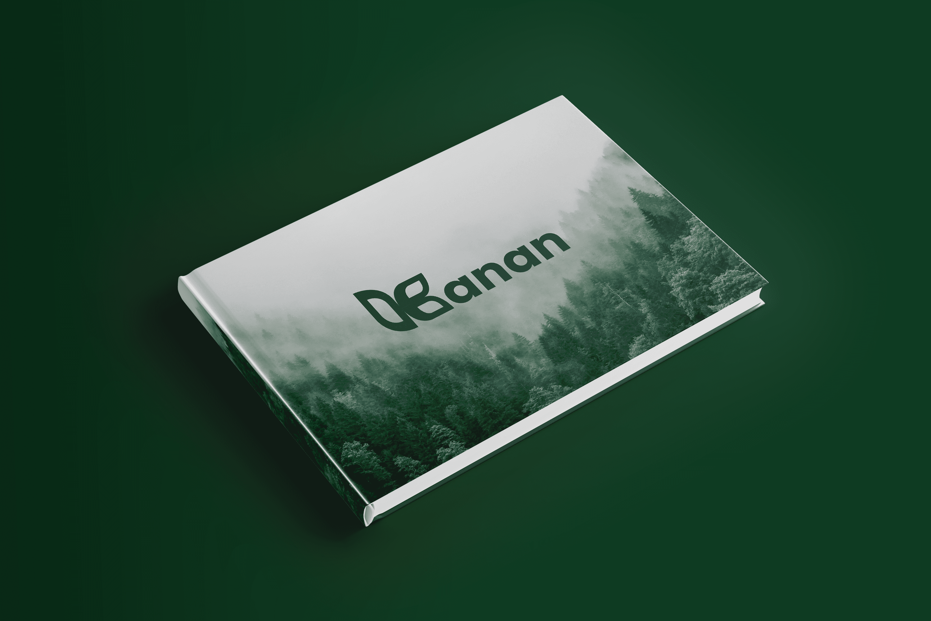
The brochure follows a minimal, editorial approach—prioritizing space, imagery, and storytelling over clutter. A restrained color palette and structured typography guide the reader seamlessly, allowing each project to feel aspirational and refined. The use of warm neutrals with deep green accents enhances the perception of understated luxury.

Stationary Design
The stationery system was designed to extend the brand’s elegance into everyday touchpoints. Subtle use of deep green, paired with warm white backgrounds and charcoal typography, ensures a clean and professional look. Every element—from letterheads to business cards—reflects clarity, consistency, and attention to detail.


(Project)


