
Turbo

Detailing

Studio
Turbo Detailing is a professional car care studio focused on delivering precise, high-quality, and results-driven detailing services for everyday drivers, luxury vehicle owners, and passionate collectors.

Challenges
Turbo Detailing Studio is a professional car care business delivering high-quality detailing services for everyday drivers, luxury vehicle owners, and car enthusiasts. Despite the quality of their work, the brand had no visual identity to match it. They approached us with one clear objective — build a complete brand identity from the ground up that was bold enough to stand out, professional enough to build trust, and strong enough to grow with the business.
Discovery & Strategy
Our work with Turbo Detailing opened with a focused discovery phase — diving deep into their service world, brand ambitions, customer expectations, and the competitive dynamics of the detailing industry. The objective was clear: carve out a distinct space for Turbo Detailing as a sharp, credible, and forward-thinking brand that speaks to car owners who take pride in what they drive.

Logo Design
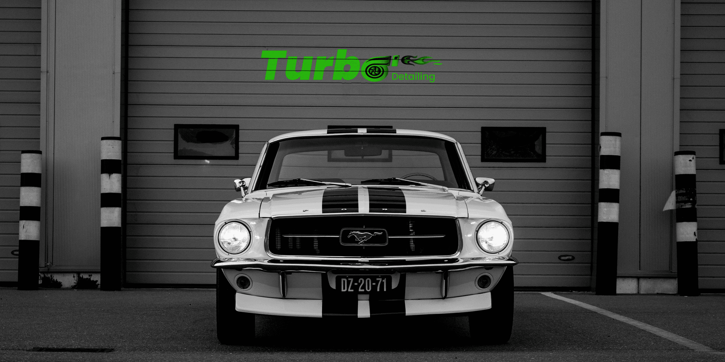
The Turbo Detailing logo was designed to do more than identify — it was built to make a statement. Poppins Bold brings confident, clean geometry to the wordmark, while the signature neon green #39FF14 cuts through the black with an electric intensity that's impossible to ignore. The defining touch — replacing the O in Turbo with a live turbocharger icon, complete with trailing flames — turns the brand name into a visual story. One look and you know exactly what Turbo Detailing is about.

Website Designing
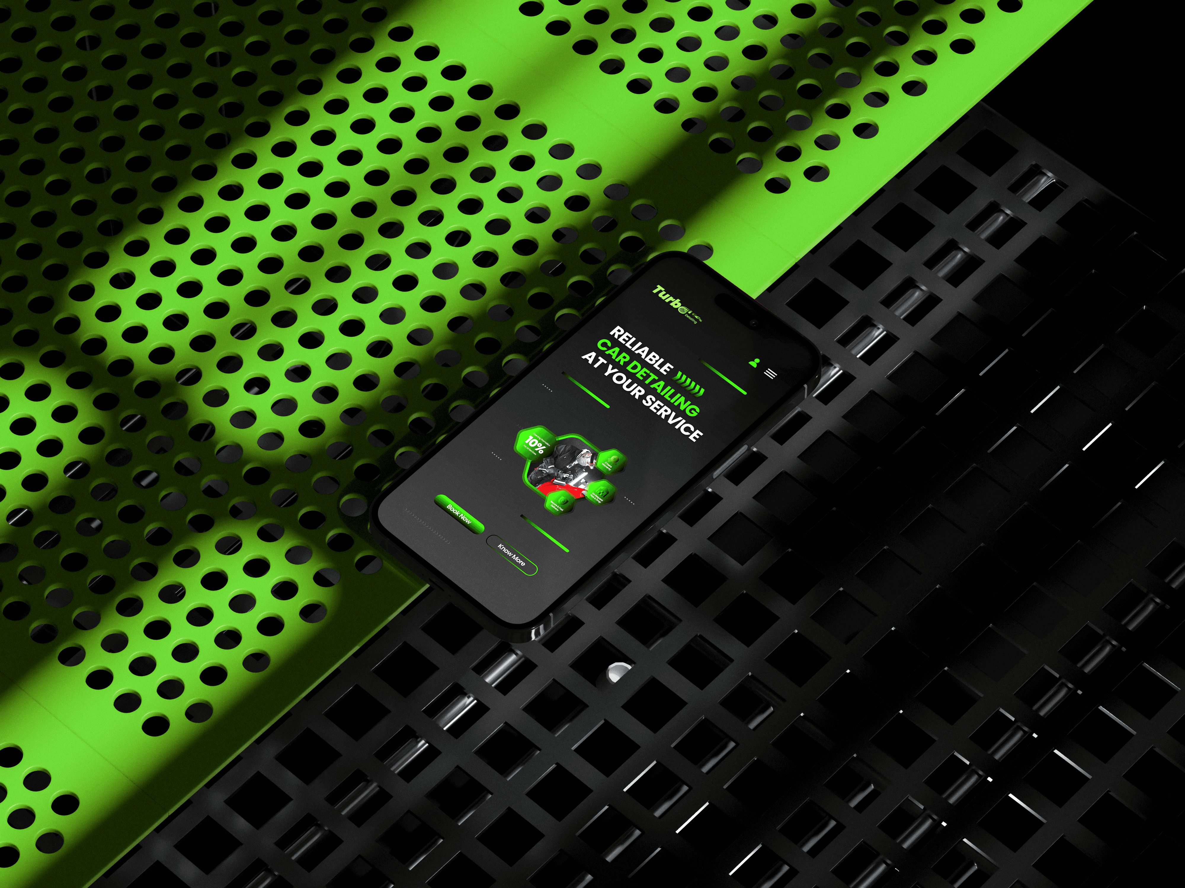
Turbo Detailing's website was designed with a clear focus on conversion — guiding visitors from first impression to booking with minimal friction. The UI leverages the bold neon green and matte black identity to create an immersive, high-impact experience, while the UX prioritises simplicity, fast service discovery, and a seamless mobile-first journey.


Brochure Desining
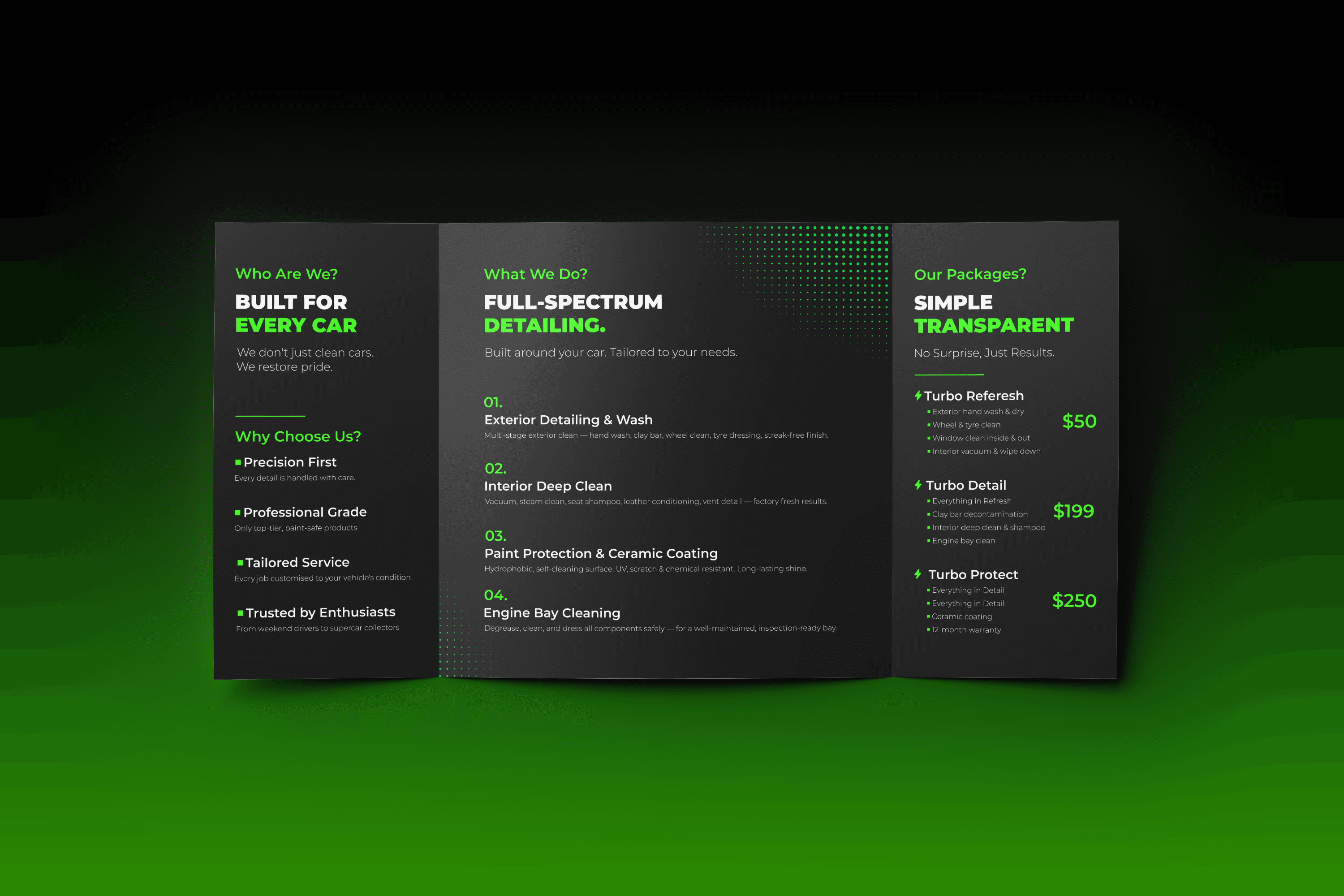
Turbo Detailing's website was designed with a clear focus on conversion — guiding visitors from first impression to booking with minimal friction. The UI leverages the bold neon green and matte black identity to create an immersive, high-impact experience, while the UX prioritises simplicity, fast service discovery, and a seamless mobile-first journey.

Assets Design
The strategy was to create a cohesive suite of print materials that felt as premium and precise as the service itself. Every piece — from the mechandise to business cards and flyers — was designed around a consistent dark matte aesthetic, anchored by the signature neon green identity, ensuring that every touchpoint a client interacts with reinforces the same message of quality, professionalism, and attention to detail.


(Project)


